
Whether a new supervisor or a decades-long director, you know data is important. That much, we have down. However, what do we do with it?
The phrase “data visualization” may have been tossed around in casual conversation, but maybe you haven’t really taken a moment to get to know what it is, what it means and why it’s important.
Let’s take a journey together on the importance of data visualization.
What is data visualization?
Data visualization is a visual portrayal of your collection of data. Whether graphs, charts or a really nicely prepared sheet, data visualization is a tool that groups your data in ways that are important to you and your organization. This gives you insight into how your company or teams are performing, based on filters or groupings you need to see.
Rather than just having mounds of data in spreadsheets to sift through, you now have a graphical representation of that data that is actionable. It’s now become a powerful and critical tool for many organizations – especially the contact center industry.
Concepts and history of data visualization
Most believe data visualization to be a very contemporary notion, as if developed in recent years by the growing data scientists and statisticians field. However, the concept and execution of data visualization has been around a long time.
Data visualization doesn’t have to be complex.
While it now involves a lot of statistics or predictive modeling, its origins start with displays like mapmaking and understanding of measurement. Since then, it’s evolved into what we mostly know it to be now: graphical and visual representations of your quantitative records.
Data visualization: Types and techniques
Cliche warning, but data visualization comes in all kinds of shapes and sizes. Some are as simple as a bar graph, line graph or even a box and whisker plot. They can get as complex as Gantt charts, non-ribbon chord diagrams and parallel coordinate plots.
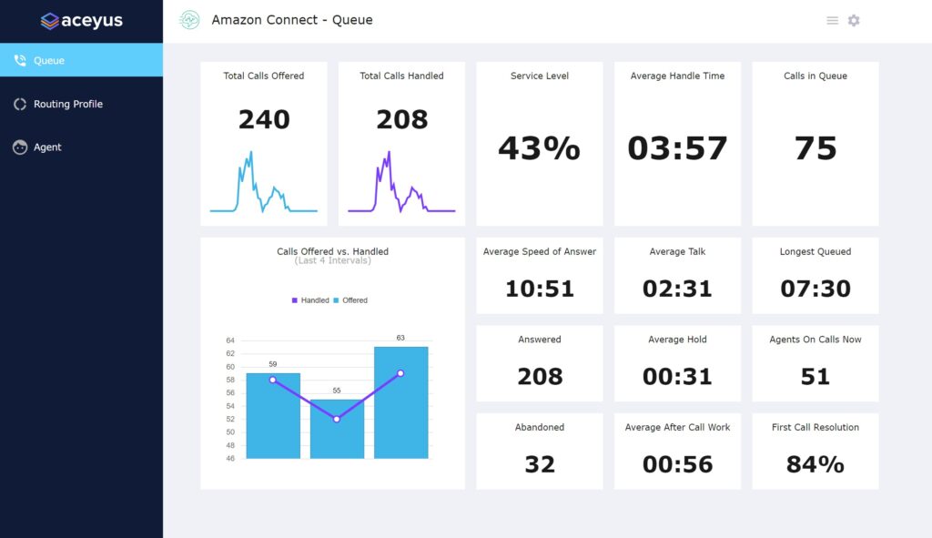
For call centers, your best data visualization tool will probably be in the form of a dashboard. You have platforms, like Aceyus, that will create these for you with your data plugged into it. The most popular types and techniques of data visualizations on your dashboards will include:
- Bar graphs
- Line graphs
- Donut charts
- Stacked area graphs
- Stacked bar graphs
- Bubble maps
Benefits of data visualization
You’ve probably developed a good sense of the kinds of benefits you gain from data visualization from reading this far. To help you out, check out some key areas amplified from this tool:
-
Faster in the race
In an industry that is now so founded on real-time stats, data visualization increases your agility. You can move faster toward actionable items to optimize performance and meet your goals.
-
In-house fact checking
With the organization and insight of your company metrics in the palm of your hands, you can now easily identify gaps in your operations. To err is human. But to have data visualization is to have pathways to solutions.
-
Customers with two thumbs up
When gaining visibility to the full customer journey, you can optimize the full customer experience. Gaining a clear picture on what your customers’ issues are means you can address them faster – and tighten the correlating areas so they’re no longer issues.
-
Stacks in the bank
You’re now able to provide a better customer experience, improve the employee experience and, best of all, save an incredible amount of resources from manually going through data. What does that mean? It sounds like money saved and money earned.
How do I make data visualization work for me?
Just start. Consult with the data science, ops and managing experts at your disposal to see your next best course of action for organizing your data. If you can’t make it happen in-house, start your search for partners like Aceyus that can make it happen for you. Once you’ve gotten visualization and dashboards set up, a quick glance at your metrics will tell you where your gaps are. From there, it just takes your step toward making those efficiencies grow.
People often say that you have to spend money to make money. While getting an effective platform to get your data visualization started may require an upfront investment, we can see the importance. An investment with this amount of ROI is something you can’t afford to miss out on.
Need an experience platform to give you customizable dashboards for your data visualization needs? Contact us at Aceyus today.